When Platform Design Goes Bad

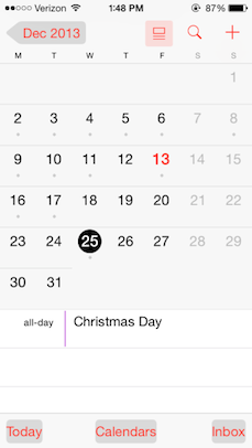
Here's an interesting design iteration in progress. Apple has added an option (currently in beta) to turn button shapes on in order to restore some semblance of usability to iOS 7.

Notes app with button shapes turned on
Calendar app with button shapes turned on

There's no other way to say this: it’s ugly. It's good Apple is aware that iOS 7 has usability problems and they are looking at fixes. But this is obviously a programmatic hack. And this goes to the root of what made iOS 7 such a frustrating release for those who have always held Apple in high regard because of their dedication to ease-of-use.

Jared Sinclair nailed it in a post a few months ago:

We’ve all seen apps that look like they were designed by talented print designers, apps with beautiful screenshots and tasteful typography that nevertheless fall apart disgracefully as soon as you actually try to use them. These apps don’t fail for lack of talent. They fail because their designers have the wrong process. They’re beginning with aesthetics and squeezing in the interactions wherever they have room to fit. The right process moves in the opposite direction. A good iOS app designer begins with touch, and only afterwards chooses aesthetics that complement and enhance the underlying touchable structure.

Apple can fix this with a well thought out design refresh for iOS 8. Unfortunately, because they have set the design guidelines that hundreds of thousands of apps are based on, any true fix will come at the expense of each of these apps needing significant updates. That's millions of hours of time wasted because Apple set out a visual framework in iOS 7 that is fundamentally flawed from a usability standpoint.

And the thing is, Apple usually excels in creating frameworks that get the basics absolutely right. Which is incredibly important when you are creating a framework for others:

If you’re designing just an app, you can fix many design errors later; if you’re designing an app platform, though, it’s hard to fix system-wide design errors without breaking existing apps.

From a technical and functional point of view, iOS 7 is a great successor to iOS 6. From a design point of view, I consider it a big step backwards.

As Marco says:

It’s easy to design something attractive that’s not very usable, and it’s easy to design something usable that’s unattractive. The challenge is striking a balance, and iOS 7 made too many usability sacrifices to achieve attractiveness.

Apple Talks

There are two important aspects to Apple's notice regarding the lost functionality in the new iWork suite:

  • On the surface, it commits to reintroducing some of this functionality within the next 6 months.
  • Implied is that there is a team working hard on iWork.

Apple rarely talks future plans, and for the most part this serves them well. That said, the level of outrage over the new iWork wasn't surprising. Most people don't know how much effort has been going into iWork, or even if there was ongoing major development now that a new version has been released. Those using iWork on the Mac only had a long gap between major releases, followed by reduced functionality, on which to base their reaction.

The limited announcement in the notice doesn't cross into the questionable territory of vaporware. Instead, it provides reassurance that this is only the start of the new iWork and that there is more to come.1 Having watched the same scenario of outrage play out across three product reboots, it strikes me that communicating plans like this immediately would have have prevented a lot of ire and criticism in each case. Let's hope Apple uses this as a model for future product transitions.

  1. And with AppleScript getting a couple shout-outs, maybe there won't be so many "Apple is dumbing down its software" comments.

Whither iWork?

There's lots of talk about the fact that iWork has lost a significant amount of features on the Mac. Many people attribute it to Apple being blind to the needs of pro users. I think the reason is far less condescending.

The phrase "the same file format for both Mac and iOS" is used on the pages for all three products. It was highlighted in Apple's keynote. It's important.

Without all versions of iWork using the same data format, true interoperability is impossible. In the previous versions of iWork you would lose some formatting & data when moving from Mac to iOS.

When you create multiple apps that use the same data format, it is difficult, if not impossible, to prevent data loss when editing files unless you have feature parity between versions. To make up a fictional example, imagine that Pages on the Mac could include images in a document while the iOS version could not. What happens to the complex text wrapping around an image when you edit the document on the iPad? What happens to page layout, and links, and your table of contents, if large chunks of content are missing? You'd end up with serious formatting errors at best, or data loss at worse.

The fact that iWork on the Mac has lost functionality isn't because Apple is blind to power users. It's because they're willing to make a short-term sacrifice in functionality so that they can create a foundation that is equal across the Mac, iOS, and web versions. It will take time to bring these new versions of iWork up to parity with what the Mac used to have. In the meantime all platforms have to live with the lowest common denominator.

Whether this tradeoff is the right call is up for debate. As someone who uses iWork a decent amount, it's frustrating that the first update major new release in over 4 years is a regression in functionality. But if iWork is a key piece of Apple's software platform going forward, it's easy to see that interoperability across versions is an important baseline requirement for them. I just hope that they continue heavy development of the software and iterate quickly.

Caveat: this is all hypothesis based on my experience designing cross-platform software. I could be wrong.

Update: It was pointed out to me that the new iWork for Mac is not the first update to the software in over 4 years. There were many updates to iWork 09 over the years. The first "major new release" is more accurate.

Forever Young

Some iOS 7 commentators have brought up the idea that we don't need visual cues like buttons, bevels, textures, and shadows to tell us what we can tap. Watts Martin asks, "Do we really still need buttons?" Matt Gemmell says,

[…] we’ve grown up. We don’t require hand-holding to tell us what to click or tap. Interactivity is a matter of invitation, and physical cues are only one specific type. iOS 7 is an iOS for a more mature consumer, who understands that digital surfaces are interactive, and who doesn’t want anything getting in the way of their content.

I appreciate some of their other insights, but I call bullshit on this specific point. Who, exactly, has grown up? In the past 30 years of traditional desktop GUIs, no one questioned the need for basic visual cues to demonstrate interactivity. When it comes to smartphones specifically, billions of people around the world have never used one. To take an example of a particularly smartphone-happy country, almost half the population in the U.S. has yet to buy one.1

Visual affordance is one of the fundamental keys to usability, and veering away from it is a sure way of creating something that is difficult for non-techies to understand. "We've grown up" is logic I've seen used many times to justify pretty designs that suffer from basic usability flaws.

This isn't meant as a criticism of the visual overhaul in iOS 7.2 It's an argument against the notion that usability should be traded for beauty. There is a lot of hubris involved in the assumption that the "we" in "we've grown up" applies to anyone outside of a tiny number of developers and designers. It's a big world out there. Let's continue creating tools that are usable for as many people as possible.

  1. According to numbers cited by Horace Dediu, U.S. smartphone penetration crossed the 50% threshold only at the end of last year.
  2. Michael Heilemann already shared some great comments on the designs of the lock screen and music app in beta 1. I'll refrain from anything further as the new design is clearly a massive job and still a work in progress.