Electron’s Gravitational Pull

John Gruber on why Claude’s Mac app is built on Electron:

[Felix Rieseberg] is one of the principal people responsible for creating Electron[…]. He literally wrote the book on Electron.

Felix Rieseberg, quite obviously, is the answer to the question why Claude is an Electron app.

Having one of Electron’s creators lead the Claude Code project is, of course, significant. But you don’t hire a midwife without expecting a baby. Claude was almost certainly going to be an Electron app no matter who led engineering.

Electron is an industry standard because most big companies are loathe to invest in UI polish. It’s an expense to them, not a way to gain users, so good enough suffices. Claude's primary audience is developers, who pick it based on (1) the models and (2) the app's dev experience. Native UI is a distant consideration, so the app only needs to clear the "good enough" bar.

[Update: Allen Pike nailed this more accurately when he described it as a tradeoff between polished UX and coordinated featurefulness. I wish I'd read his piece earlier, not only because it's an accurate analysis, but also because I wouldn't have unintentionally picked a copycat title.]

Case in point: ChatGPT was off to a good start with their Mac app. Their focus on the consumer market probably motivated them to make it nice. But over the past couple months, bugs have accumulated and been left unfixed. OpenAI's eyes are now on the dev audience prize that Anthropic has a grip on, so their Codex app is evolving rapidly. (It’s an Electron behemoth besting Claude’s 750 MB size to weigh in at a shocking 1.4 GB.)

[Update 2: Just a few days after posting this, the native ChatGPT app has been sent into retirement.]

The result of OpenAI's wayward attention is that I now find the ChatGPT app jankier than Claude and Codex, despite it being native. It pains me to write that. I'm a '90s Apple kid. Native apps are in my blood. But big tech companies have always had an aversion to good taste when it comes to software. Indies have been the ones to lead the way in quality, in fit and finish, in Mac-ness.

When Mac OS X launched, Cocoa gave small teams the power of much larger ones and Mac users ended up with the Delicious Generation. If Cocoa was a shot of caffeine for small teams, AI is a Scarface-sized pile of cocaine.

I know because I’m not a developer and I used it to create a Mac-assed Mac app for myself. (An audio comparison app, like Kaleidoscope but for audio files.) If even I can make something like that, I can't wait to see what actual indie developers make.

Much as I would like Big Tech to stop making Electron clunkers (I'm looking at you too, 1Password), I don't expect a sudden change of heart. Nevertheless, there's suddenly more potential than there's been in years for a resurgence of great Mac apps.
Minimalist Extremism

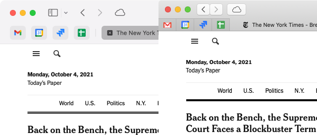
Apple originally sold Safari 15’s unified tab bar as a way of saving space. When it became clear that defaulting to that design was, to put it mildly, problematic, they reverted to a redesigned separate tab bar that takes up more space than ever in both dimensions.

Safari 15 on Big Sur (left) vs Safari 14 on Mojave (right)

The thing is, saving space is a great goal for a UI! The vast majority of people using traditional computers are on laptops. Pretty much the entire computing world, excepting some professions, has converted to the equivalent of apartment living. Screen real estate is at a premium!

Unfortunately, the ultra minimalist design trend over the last 10 years has ignored this reality. Designers have steadily removed elements that can be used to create coherent, compact designs: borders, shadows, color, shading. All have been kicked to the designer shitlist.

We’re left with just a couple tools to convey hierarchy and structure: lots of negative space, and in some places, large header text.

This trend has eroded usable screen space. And like erosion, it has happened almost imperceptibly, through many small changes over the course of years. But the sum of the changes across the entire ecosystem of Mac apps has been that, simply put, I can fit noticeably less on screen today than 10 years ago.[1] I used to regularly reference 2-3 windows simultaneously. These days, most apps and web pages require so much space that it’s one-at-a-time.[2]

When I saw Newsstand, the new RSS app for Mac OS 9, I found it a shocking reminder of how much information used to be conveyed, usably, in a small window.

I’m not suggesting that the primary goal of UI design should be to pack as much on screen as possible. Obviously design is a balancing act – usable hit targets vs. density, visual affordance vs. clutter, etc. But I do think that the pursuit of minimalism has caused us to ignore information density for too long.[3]

In short, while a redesigned Safari 15 for Mac can’t come quick enough, what I’m really wishing for is a broader shift away from minimalist extremism in UI design.


  1. To be fair, minimalist design is not the only factor here. Designers work on large screens, which often shields them from the effects of their work on normal screens. And of course the big one: touch devices require larger tap targets and spacing, and mobile design is understandably in the driver’s seat in general. ↩︎

  2. One of the advantages the Mac always had over Windows, dating back to the classic Mac OS days, was its windowing system. It encouraged having many windows on screen at once. Windows was so clunky that you were almost forced to maximize every window into full screen mode. Working on a Mac looks messy but feels fluid. Windows’s full screen & tiled layouts look tidy but feel rigid. ↩︎

  3. This is just one of a few maddening regressions that Apple has been leading the charge on when designing for, I have to stress, interaction. The evolution of Safari over the course of several versions of both macOS and the app itself is representative of a lot of Apple’s UI design in general. First color disappeared, then buttons, then pretty much any differentiation between different types of UI controls, then the differentiation between browser & content. It often feels like Apple approaches UI design as if they were designing a magazine. ↩︎

Private Facebook

Some people are sceptical that Mark Zuckerberg truly intends to shift Facebook's focus to private, encrypted communication.

I think we can take Zuckerberg at face value here. Product-wise it implies a shift in direction and a lot of work. But it doesn't require Facebook to alter its core business.

Whether users communicate publicly or privately with Facebook's products, the company will still have access to vast amounts of data on every user to sell ads against. And it won't necessarily change how un/ethically they use it. This wouldn't have any impact on, for example, using 2FA phone numbers to target ads at users. Or whether Facebook's algorithms promote clickbait conspiracy content because that's what people engage with.

Coincidentally, it sure helps them make the case for integrating Messenger/Instagram/WhatsApp.

There may be some positive changes that come out of this, but for the most part it seems like business as usual.

Older posts